
This article explores the how we established our UI Pattern Library which is bringing visual consistency to our customers and significant time savings to our development team.
Background
In early 2015 I joined Webjet as their first in-house UX Designer.
At that time Webjet operated two brands in four countries and sold seven distinct products. To service smartphone users these products utilised a mix of independent mobile sites, responsive design sites, and a native iOS app. Each solution had been built at different times, sometimes by different teams, without an in-house designer across them.
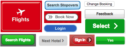
The Webjet user interface had been influenced by many design trends over a 15 year period. Buttons appeared throughout the properties with a mix of 3D bevels, gradients, thick solid borders, drop-shadows, etc.
The lack of visual consistency detracted from brand trust, reduced the learnability of the interface, and ultimately hampered our user’s efficiency. See ‘Consistency in the Omnichannel Experience‘ and the ‘10 Usability Heuristics for User Interface Design‘ for more on the value of visual and behavioural consistency.
When my first UX project was approved the dev team requested full design specifications – button colours, hover states, text colours, paragraph margins, etc.
There were no UI standards for anyone to refer to.
Additionally, it became apparent that the development team had a resourcing challenge. UI elements were regularly implemented by experienced back-end developers with only surface-level knowledge of front-end technologies. Even with the same design specifications, two developers could deliver widely different implementations, which reduced opportunity for UI pattern reuse and complicated the site’s maintainability.
Plan of attack
I needed to establish the extent of the UI disparity in a format that all stakeholders could understand. To do so I built an UI inventory.
The steps to build an UI inventory are simple – start with a blank slide deck, take a screenshot of any new/different UI element you encounter while browsing through the site, then group the screenshots into categories.
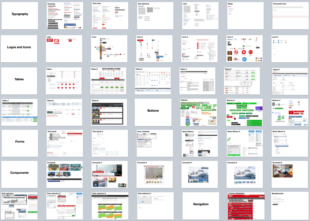
If you’re interested in a closer look, you can download the UI Inventory PowerPoint document from Mar 2015 (15mb).
Stakeholder buy-in & strategy
To address the lack of standards and resourcing challenges I worked closely with the key stakeholders including the lead developers, marketing, product owners, visual designer, and the most front-end savvy developer within the existing team.
The goals were to:
- Get buy-in for the establishment of a UI Pattern Library
- Establish a formalised workflow for UI design and implementation
- Establish a dedicated front-end team
- Clarify ownership of the UI Pattern Library
The UI Inventory illustrated the need for a centralised UI Pattern Library was undeniable and the stakeholders clearly saw the opportunity for increasing development efficiency and providing a consistent user experience. The discussion then moved to how to move forward given the broad impact of such a tool.
In the whiteboard photo below you can see the outcomes of a stakeholder workshop where we answered the 4 goals above. This is explained further below.
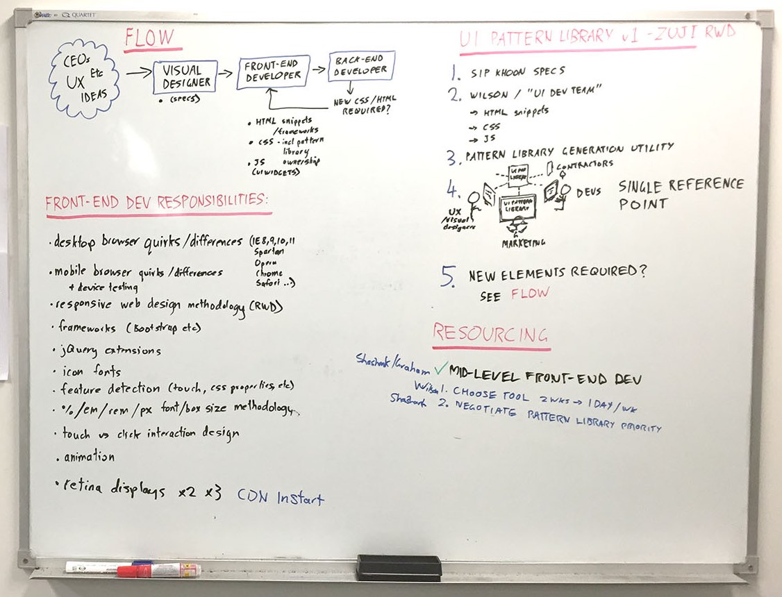
Workflow
We established the following workflow for new UI work:
- All UI elements are to be designed by a Visual Designer, who will provide specifications to the yet-to-be-created Front-End Team.
- The Front End Team will then create the HTML snippets, CSS, and Javascript (for UI widgets), place them in a centralised, organised, well-commented repository in GitHub. This will be known as the UI Pattern Library repository.
- Back-end developers will then utilise the pre-written front-end code.
- If projects manage to slip past the Front-End Team, the back-end developers are to liaise with the Front-End Team who will create or refine the UI Pattern Library repository and involve a Visual Designer as necessary.
Ownership of the visual design was placed with the Visual Designer (in tight collaboration with the Head of Marketing).
Ownership of the UI Pattern Library repository was taken by our most front-end savvy developer, whom would become the leader of the Front-End Team.
Resourcing
We needed a dedicated front-end team to establish and reinforce this workflow.
To build the case for additional team members I listed out the typical concerns of a front-end focused developer to contrast against the concerns of a back-end focused developer.
- Desktop cross-browser & cross-platform quirks resolution (IE x, Safari, Firefox, Google Chrome, Opera, etc)
- Smartphone cross-browser & cross-platform browser quirks resolution
- Responsive web design methodology (breakpoints, media queries, etc)
- Frameworks (ie Bootstrap)
- Javascript library extension utilisation and authoring
- Icon font implementation
- Feature detection (touch, CSS properties, etc)
- Font & box size methodology (% / ems / rems / px)
- Touch vs cursor interaction design
- Animation
- Retina image implementation strategy
Few back-end developers are masters of all of the above. It is a field that is constantly moving, and on-going research is required to efficiently cover off these topics.
The lead developers agreed this skill set was worth building an internal specialisation around, and they began recruiting a front-end developer to join this newly created Front-End Team.
Prioritisation
It became clear that the establishment and multi-brand, multi-product implementation of a UI Pattern Library was not going to be prioritised over existing project work.
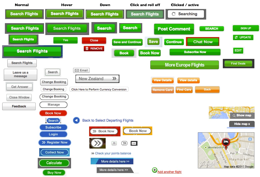
To get the ball rolling, we ‘piggybacked’ an existing UI-heavy project (our Hotels website re-platforming) and started with standardising a single UI element – buttons.
UI Pattern Library Creation Process
Design
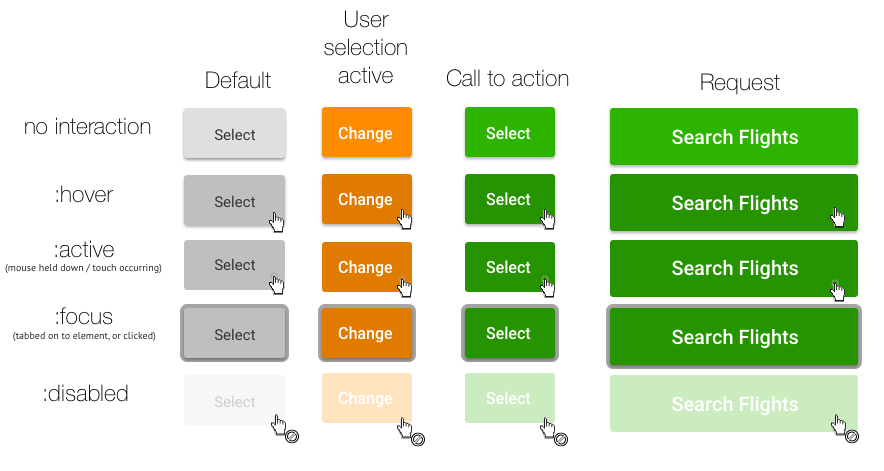
Following the workflow we established for new UI work, I created the specifications for a standard suite of buttons. These catered for the various use cases and states they would be seen in, with a focus on touch and accessibility.
We assessed various design influences for their respective usability qualities – skeuomorphism, flat design, Google material design, etc. Ultimately we settled on the following as it met a balance between usability (elements looking clickable) and simplicity (flat colour).
Front-end Development
Our front-end team chose to write the CSS styles in independent LESS files to avoid the all-in-one-file legacy they had inherited. These would then be processed to translate the LESS into CSS syntax, combine the independent files, and minimise the output for use in production environments.
Automation
We needed a platform that let marketing and visual designers see developed UI elements in various contexts before approving them to go through to production.
Our developers required details of when and how to implement UI elements.
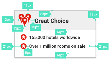
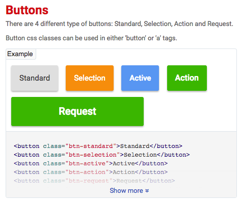
After a bit of research and experimentation our lead front-end developer settled on a UI Pattern Library documentation automation tool called Hologram.
Hologram allows you to write your CSS styles as per normal (using LESS in our case) and then display the styles in a well structured and documented form. The documentation for each style is written in markdown. The output looks like this:
We hosted the documentation on Microsoft Azure to get them online quickly.
Consumption
The GitHub repository allows our developers and 3rd parties to access and use the latest UI patterns in their projects. They can read the associated implementation details in the live UI Pattern Library, and copy HTML for use in their projects. We’ll share more technical details (involving Bower and tailoring HTML snippets for React use) in a separate blog article.
Expansion and outcomes
Now that the infrastructure was in place and we demonstrated button styles could be successfully centralised and consumed, we began building on this. As the project did not have prioritisation above existing work, we added elements that were being used in existing project work. I commandeered a wall beside the office’s main entrance to communicate the state of the UI Pattern Library and encourage use and involvement.
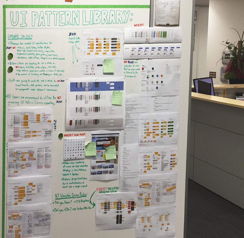
Over the course of several months we built out a broad number of UI elements. Standardised headings, form elements, modals, tooltips, accordions, and more.
Initially all design specifications were created manually (colours, padding, margins, font size, etc) however in mid 2016 we switched to using Sketch Measure to automatically generate interactive design specifications. This dramatically reduced the time spent preparing the UI work for the development team, updating specs after design alterations, and the margin for error when interpreting design specifications.
We used the centralised model to educate the broader development team on how to address UI challenges such as retina display iconography and imagery, dropping older methodologies in the process.
It provided the front-end development team a blank slate to begin overhauling the multi-brand, multi-channel legacy stylesheet that they had avoided refactoring due to lack of prioritisation and fear of breaking functionality.
As the team continues to work on our customer-facing systems our array of legacy UI styles are phased out, and the centralised model allows us to manage our brand and customer experience in a far more agile manner.
View the Webjet UI Pattern Library and in-context example for our Webjet Packages site.